
If you run a business in 2026, you’re not short on data but probably drowning in it. But numbers alone don’t help you make better decisions. Insight does. That’s where business intelligence (BI) tools can help. Modern BI platforms aren’t just about charts. they connect your systems, clean your data, surface patterns, and also help leaders act faster with confidence.
The right BI tool can improve forecasting and reduce waste while spotting growth opportunities and aligning teams around shared truth. But here’s the challenge: there are dozens of BI tools claiming to be the best. So how do you choose which one to use?
This guide walks you through the top business intelligence tools for 2026, what they do well, and who they’re best for. It also emphasizes how to think about selecting the right platform for your organization.
What are the Top Business Intelligence Tools?
We now have business intelligence software to help us turn data into insight. In 2026, a number of standout platforms help you make smart choices for your organization. Tools like Microsoft Power BI, Tableau, Qlik Sense, Looker, and Sisense all provide strong methods for connecting data from multiple sources. They then create interactive dashboards and maintain real‑time visibility into important key performance indicators or other measurements.
However, top business intelligence tools provide much more than visualization. They offer superior data-handling capabilities for processing large datasets, self-service analytics for non-technical users, and integration with existing systems such as CRMs and ERPs. Basically, they are built for both technical and non-technical users alike, delivering insights accurately, clearly, and thoroughly.
What Business Leaders Should Expect from BI in 2026
As technology becomes more prevalent and competition increases, leaders such as yourself, want tools to provide more than just basic functionality. smart data and AI capabilities are becoming the standard. Gartner reveals that by 2029, 10% of global boards will use AI guidance to challenge executive decisions that are material to their business.
Today’s leaders expect top business intelligence tools to:
1) Deliver real-time visibility
2) Predict trends before they become problems
3) Automate routine analysis
4) Support cross-team collaboration
5) Reduce reliance on manual spreadsheets
6) Turn raw data into decisions
Evidently, a strong BI platform should feel like a strategic advisor rather than a reporting tool. Additionally, now leaders don’t just want descriptive analytics, which tell you what’s happening, or even predictive analytics, which are a step ahead and provide forecasts on what is likely to happen next. They want BI tools to extend to prescriptive analytics, which tell you what to do about what is happening. This is what turning raw data into decisions literally is.
So, what should you as a business leader expect from BI now?
For starters, when evaluating options, make sure you focus on these four pillars:
1) Clarity: Can your team understand insights easily and without extra support?
2) Speed: How quickly can decisions be derived from data?
3) Scalability: Will it grow with your business?
4) Governance: Can you trust the data?
Then, you need to conduct an advanced analysis to make a final decision. To do so, consider the following factors:
1) Does it help you discover insights faster? Look for features that help you spot trends, do comparisons, and generate AI-derived conclusions that tell you what to do next or help you identify problems.
2) Can insights turn into action? Does the tool have workflows powered by AI agents that can trigger automatic action from insights? For example, reducing ad spend on social media platforms or adjusting the audience for a particular campaign.
3) Is there a strong community or support system? Popular tools have dedicated forums or strong customer support options available in case customers run into roadblocks or need guidance.
With that lens in mind, let’s see which top tools are shaping BI in 2026.
Power BI: Enterprise Strength And Wide Accessibility
Power BI continues to dominate as a balance of power and usability. It connects easily to Microsoft ecosystems, cloud services, and legacy systems. Leaders value it for its ability to transform scattered data into unified dashboards that drive quicker decision-making. Executives like Power BI because it can easily be deeply integrated into various different business software, and it provides scalable analytics for growing organizations. Therefore, whether you need to see simple analytics or slices of much larger datasets, Power BI can meet your needs. Additionally, it offers strong governance and security features and provides easy-to-understand AI insights for audiences without technical backgrounds. If you are already invested in Microsoft infrastructure, it’s the best bet for you.
Best for: Mid-to-large organizations needing centralized reporting and enterprise-level analytics.
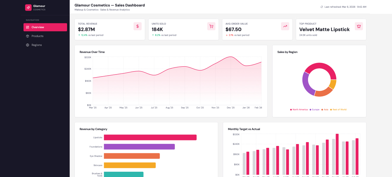
Check out an example of a Power BI sales dashboard for a hypothetical cosmetics brand.
Pros of Power BI
1) Strong visualization tools
Turn your messy data sets into storytelling dashboards easily. Even non-technical users can drag, drop, and experiment with ease.
2) Tight Microsoft ecosystem integration
If your organization already uses Excel, Azure, or Teams, Power BI fits in naturally. Data flows feel familiar, which lowers adoption friction and ensures you are set up in little to no time.
3) Cost-effective entry point
Licensing is relatively accessible compared to many enterprise BI platforms. No heavy upfront fees or investment is required, making it ideal for small teams.
4) Scales with complexity
Start with simple reports, then layer in advanced modelling, DAX formulas, and automation as your needs grow.
5) Active community and learning resources
There’s a huge ecosystem of tutorials, forums, and templates. When you hit a wall, don’t fret because it’s highly likely that someone has probably solved that exact problem before, and a solution exists.
Cons of Power BI
1) Learning curve for advanced features
Basic dashboards are easy, but advanced modelling is more difficult. If your team lacks analytics experience, DAX and data relationships can be difficult to manage.
2) Performance limitations with large datasets
Handling very large or highly complex datasets sometimes requires optimization. It also requires architectural planning, especially outside premium environments.
3) Customization boundaries
Visuals are strong, but specialized layouts or interactions may require additional support or third-party visuals.
4) Dependency on data structure quality
Power BI rewards clean, well-modelled data. Chaotic data sources may cause you to spend a substantial amount of time fixing pipelines and not leave enough for building insights.
5) Collaboration quirks
Power BI supports mixed environments, whether on-site, hybrid, and remote, with seamless sharing and version management.
In practice, Power BI isn’t about flashy dashboards and more about creating consistent visibility across a business. Teams that treat it as part of a broader data strategy tend to get the most value, while those expecting instant magic often end up slightly disappointed.
Tableau: Visual Storytelling Powering Decisions
Tableau is best for turning complex data into visual narratives. Executives don’t want endless tables. They want clear stories. Tableau excels at helping leaders see patterns, trends, and risks instantly and without requiring extensive technical skills. If your organization requires cross-departmental collaboration, Tableau is a great choice. It shines in environments where insights need to be communicated clearly across teams.
Best for: Organizations focused on visual decision-making and cross-team insight sharing.
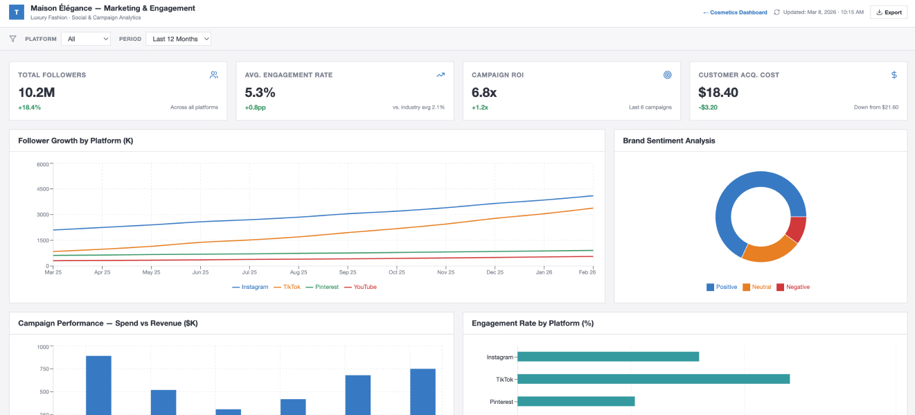
Check out the sample Tableau dashboard showing marketing and engagement analytics for a fashion brand.
Pros of Tableau
1) Exceptional data visualization
Charts are polished, interactive, and easy to understand. This makes it ideal for clear presentations and executive dashboards.
2) Intuitive drag-and-drop interface
You don’t need to be a developer to build useful dashboards. You can explore the interface without writing complex code.
3) Handles complex datasets well
Tableau can easily work with layered or large datasets. There is no need to build reports from scratch to analyze them from a new angle. Simply slice them and analyze the information you need.
4) Fast exploratory analysis
It’s designed for discovery. Users can ask new questions on the fly and immediately see how the data responds. This supports deeper insights and faster decision-making.
5) Broad data connectivity
Tableau connects to a wide range of data sources, from spreadsheets to cloud warehouses. This keeps things flexible, enabling teams to centralize insights without significant restructuring.
6) Strong community and ecosystem
There’s a large, active user base, and they are enthusiastic about sharing information. You will find templates, techniques, and tutorials, paving the way for easy troubleshooting and making skill development much simpler. While Tableau is powerful, it isn’t perfect for every team. Some trade-offs become clear once you start scaling usage or managing more complex reporting needs.
Cons of Tableau
1) Higher cost at scale
Licensing can add up quickly, especially for larger teams. If your organization has many casual users, the pricing model may be considered expensive compared to some other options.
2) Learning curve for advanced features
Basic dashboards are easy to build, but deeper calculations and complex data modelling have a steeper learning curve. New users can feel overwhelmed when trying other features beyond surface-level reporting.
3) Data preparation can require extra tools
Tableau is my favorite for visualization, but raw data often needs cleaning or structuring beforehand. Teams without strong data processes may rely on additional tools or workflows, but then a good data foundation is essential for analytics in all cases.
4) Performance depends on setup
Large datasets or poor integrations can slow dashboards. Performance tuning becomes important as usage grows.
5) Less built-in automation
While it integrates with other systems, Tableau itself isn’t designed as an automation platform. Teams needing workflow orchestration must look elsewhere for certain features.
6) Collaboration controls can feel limited
It’s complicated to manage permissions, versioning, and shared workflows in bigger environments without strong governance practices as there are limited features controlling access.
Tableau is one of the best tools for exploring and visualizing data. You get plenty of flexibility to dive into information, derive insights, and tell clear stories with dashboards and charts.
Companies that spend time on training and preparing their data usually get the most out of it. However, it isn’t the easiest tool to learn, and some setups can get expensive, specifically if you have several users. Regardless, for teams that want strong visuals and deep insights, it is a solid choice.
Qlik Sense: Associative Analytics for Better Discovery
Qlik has an associative data model that helps it stand out. You can explore data relationships dynamically as it doesn’t restrict you to linear queries. For example, as a sales manager, you can start by exploring sales by region. However, you can also delve into granular details like products, customers, segments, and time periods, and you don’t have to enter a new query. Qlik Sense helps spot patterns and such as which products are most popular for a particular customer segment in a month, and you can easily adjust strategy within minutes. This encourages curiosity-driven analysis, which is ideal for strategic planning. Qlik is particularly strong when businesses need to uncover hidden patterns or complex relationships.
Best for: Data-rich environments requiring advanced exploration and discovery.
Pros of Qlik Sense
1) Associative data model
Explore all your data freely by jumping from one dataset to another instantly. You aren’t stuck in one path.
2) Smart visualizations
It automatically suggests charts and graphs that make your data easier to understand.
3) Self-service analytics
Teams can create their own reports and dashboards quickly. So, whether you are from marketing, finance, or operations, you can simply click and generate without having to ask a tech rep.
4) Responsive design
Works well on laptops, tablets, or phones, so you can check insights anywhere.
5) Strong data integration
Connects to several different sources: databases, spreadsheets, and cloud apps, so you can see all your data in one single source of truth.
Qlik Sense makes exploring and understanding your data easier and faster than many other traditional BI tools. Its flexibility and self-service features give teams a lot of power, but like any platform, it isn’t perfect for every situation. Let’s look at some of the limitations you should keep in mind.
Cons of Qlik Sense
1) Steeper learning curve
It’s flexible, but new users may have trouble learning all the features and getting comfortable building dashboards.
2) High Cost
Licensing can be expensive, and scaling for large teams also comes at a higher cost compared to some other BI tools.
3) Complex setups for advanced analytics
Integrating multiple data sources or creating very advanced analytics setups sometimes requires IT support.
4) Slow performance with huge datasets
It slows down with extremely large datasets or very complex dashboards if not optimized.
5) Limited out-of-the-box visuals:
While Qlik Sense is flexible, ready-made templates are limited. You may need to customize some charts to make them look a certain way.
Overall, Qlik Sense is a powerful choice for teams that want to explore data freely and create insights on their own. Its flexibility and smart analytics make it stand out, but it can take time to learn and may require extra resources for very large or complex setups. For organizations looking for strong visual storytelling with a slightly easier learning curve, the next tool on our list might be a better fit.
Looker: Cloud-First Analytics with Strong Governance
Looker is all about consistency and trust. Leadership alignment is necessary to understand complex data models. Its modelling layer ensures everyone in the organization uses the same data definitions, which is a major plus.
Best for: Businesses focused on data consistency and long-term analytics governance.
Pros of Looker
1) Consistent data definitions
Looker makes sure everyone in the company is using the same numbers and calculations, so there are no conflicting reports or misunderstandings.
2) Easy access to insights
Simplicity and an easy learning curve is what sets Looker apart. Teams can explore data without needing to write complex queries every time.
3) Several integration options
It connects to lots of databases and cloud tools, bringing all your data together in a single source of truth.
4) Custom dashboards and reports
Users can build dashboards tailored to their needs, making it easier to track key metrics.
5) Collaboration features
Teams can share reports, add comments, and make decisions faster as everyone seeing the same data.
Looker is great for teams that need consistent, reliable data and want to enjoy an easy learning curve so that they don’t have to turn to IT for support every minute. Its collaboration and integration features make it easy for everyone to be on the same page. That said, no tool is perfect, and there are some things to be aware of before committing.
Cons of Looker
1) Learning curve for modelling
Looker uses LookML to define data models and while the rest of the tool is intuitive, this part can be tricky for beginners.
2) Can be slow with large datasets
Very complex queries or massive datasets may take longer to load.
3) High Cost
Larger teams may be at a disadvantage with high costs per user.
4) Limited out-of-the-box visual options
Customizing charts beyond the basics can require training and effort
5) Dependence on IT for setup
Initial setup which includes modelling and connecting multiple data sources, requires technical support.
Looker isn’t a bad choice if you want consistent, reliable data and easy collaboration across departments. However, setup p can be complicated, and technical support may be required at this stage. However, it is easy for non-tech people to use after initial setup. However, it lacks visual flexibility unlike Tableau and Power BI.
Also Read: Top 5 AI Tools for 2026
ThoughtSpot: Faster Answers with Search-Driven Insights
ThoughtSpot makes analytics feel like using Google. The most amazing feature is that executives can type questions in plain language and receive instant visual answers. This lowers barriers to data exploration and significantly speeds up decision-making. It encourages data use at every level of the organization. Users often praise the intuitive design, ease of use for non -technical teams, and the superb customer support.
Best for: Fast-paced businesses that value accessibility and speed.
Pros of ThoughtSpot
1) Search-driven analytics
You can simply type questions in plain language and instantly get answered with charts and graph, without writing complex queries. Ask for a 10-year comparison or ask it to show you the top products by sale.
2) Fast performance
Handle large datasets within minutes. ThoughtSpot is best for speed and reliability.
3) AI-powered insights
Automatically highlights trends, patterns, and unusual changes in the data.
4) Self-service friendly
Non-technical teams such as marketing and sales can explore data and generate reports on their own without relying on analysts.
5) Strong cloud integration
Works smoothly with modern cloud data platforms and is easily scales as the business grows.
6) Interactive dashboards
You don’t have to enter a new query. Drill deeper into data directly from charts to uncover more detailed insights.
ThoughtSpot is great for teams that want a simplistic, straightforward experience and don’t want to have to go through complex reports. If you have a fast-moving business, its search-based approach and lightening speed performance is a great advantage. However, it comes with a few tradeoffs.
Cons of ThoughtSpot
1) Learning curve for setup
Searching is easy but setting up the data model correctly often requires technical expertise.
2) High cost
If you have a large team or want advanced features, pricing can be high.
3) Limited customization for visuals
There are fewer design options compared to some other BI tools.
4) Best with clean data
ThoughtSpot works best when your data is already well organized. Messy data can limit its effectiveness.
5) Dependent on strong data infrastructure
If you don’t have a modern cloud data warehouse in place, performance may not be optimal.
ThoughtSpot is a strong option for companies that want simplicity and a more modern, search-driven way to explore data. It works especially well for organizations with solid data infrastructure. Still, it may not be the perfect fit for every business, especially if you are looking for deeper customization or lower costs. Let’s now look at the next BI platform, Sisense, and see how it compares.
Sisense: Focus on Embedded Analytics for Product-Driven Companies
Sisense focuses on embedding analytics directly into applications. This is powerful for organizations delivering data-driven services to customers or internal teams. It supports businesses building analytics into their products or workflows, which enables quick action.
Best for: Software-driven companies and analytics-heavy environments.
Pros of Sisense
1) Handles complex data
Sisense is strong at combining data from many different sources, even large and messy datasets.
2) In-chip technology
It processes data in a way that helps dashboards load quickly, even when working with big data.
3) Customizable dashboards
Users can design dashboards to match their business needs and branding.
4) Embedded analytics
Sisense makes it easy to add analytics directly into other apps or platforms.
5) Scalable platform
It grows with your business, making it a good choice for companies planning long-term expansion.
6) Strong data modelling tools
Teams can build flexible data models that support deeper analysis.
Overall, Sisense is a strong choice for businesses that deal with complex data and need a flexible, scalable solution. It works especially well for companies that want to embed analytics into their own products or platforms. However, like every BI tool, it comes with a few challenges that are worth considering.
Cons of Sisense
1) Learning curve
While powerful, Sisense can take time to fully understand, especially for non-technical users.
2) Setup can be technical
Initial configuration and data modelling often require experienced IT support.
3) Cost
Pricing may be higher for smaller businesses or teams with limited budgets.
4) Interface may feel less modern
Some users find the design less polished compared to other visualization-focused tools.
5) Performance depends on setup
If not optimized properly, complex dashboards can slow down.
Sisense is a powerful option for businesses that deal with complex data and need a solution that can grow with them. It stands out for its ability to combine large datasets and support embedded analytics, which makes it appealing for product-driven and data-heavy teams. However, it may require technical expertise and a larger budget to unlock its full potential. For organizations that want flexibility and scalability, Sisense can be a strong contender, especially when backed by a clear data strategy.
Domo: Real-Time Business Visibility
Domo is built for leaders who want constant awareness of operations. Its dashboards focus on live data, alerts, and performance tracking. It’s particularly useful for operational decision-making.
Best for: Leaders needing continuous performance visibility.
Pros of Domo
1) All-in-one platform
Domo combines data integration, visualization, and collaboration in one system.
2) Strong cloud capabilities
Built as a cloud-first platform, making it easy to access from anywhere.
3) Real-time data updates
Dashboards refresh quickly, helping teams make fast decisions.
4) User-friendly interface
The platform is fairly easy to navigate, even for non-technical users.
5) Mobile access
Domo has strong mobile features, allowing leaders to check insights on the go.
6) Built-in collaboration tools
Teams can comment, share dashboards, and discuss insights directly inside the platform.
Overall, Domo makes it easy to bring data together and share insights across teams. Its cloud-first design and mobile access make it especially appealing for fast-moving organizations. Still, there are a few challenges businesses should consider before committing.
Cons of Domo
1) Cost
Domo can be expensive, especially for smaller businesses or growing teams.
2) Learning curve for advanced features:
While basic use is simple, deeper data modelling and customization can take time to master.
3) Limited customization compared to some competitors
Some users feel visual design options are not as flexible as other BI tools.
4) Data preparation can require support
Complex integrations may still need help from technical teams.
5) Performance with very large datasets
Extremely complex dashboards may require optimization.
Domo is a strong choice for organizations that want a cloud-based BI platform with built-in collaboration and real-time visibility. It works especially well for companies that value accessibility and quick insights across departments. However, the cost and learning curve may be factors to weigh carefully. For businesses looking for a modern, mobile-friendly BI solution that keeps teams connected, Domo is definitely worth considering.
Zoho Analytics: Practical for Growing Businesses
Zoho Analytics emphasizes accessibility and affordability without sacrificing capability. It’s designed for organizations that want meaningful insights without enterprise complexity. It’s a strong option for mid-sized businesses modernizing analytics.
Best for: Growing companies seeking approachable BI.
Pros of Zoho Analytics
1) Affordable pricing
Zoho is generally more budget-friendly than many other BI tools, making it a good choice for small and mid-sized teams.
2) Easy to use
The interface is simple and intuitive, so even non-technical users can create reports and dashboards quickly.
3) Good integration options
Connects easily with other Zoho apps and popular third-party platforms like Google Sheets, Salesforce, and SQL databases.
4) AI-powered insights
Zia, Zoho’s AI assistant, can automatically detect trends, anomalies, and key patterns in your data.
5) Custom dashboards and reporting
Users can tailor dashboards to meet their business needs.
6) Cloud-based access
Being fully cloud-based, Zoho Analytics can be accessed from anywhere with internet access.
Zoho Analytics makes data accessible and actionable for teams of all sizes, especially for small to mid-sized businesses. Its affordability and AI features are definite highlights. But, as with any tool, there are some limitations to be aware of before fully committing.
Cons of Zoho Analytics
1) Limited advanced features: Compared to enterprise-level BI tools, some advanced analytics and customization options are missing.
2) Performance with very large datasets: Extremely large or complex datasets may slow down reporting.
3) Learning curve for complex reports: While basic dashboards are easy, creating highly detailed reports may require extra time.
4) Fewer visualization options: Some users feel the chart and graph options are less flexible than in Tableau or Power BI.
5) Integration depth: While it integrates well with many apps, some niche or custom data sources may need workarounds.
Zoho Analytics is a solid, cost-effective BI solution for small and mid-sized teams that need quick insights and easy reporting. It’s particularly strong for businesses already using other Zoho tools, or for teams just starting with BI. While it may not have all the advanced features of enterprise platforms, its simplicity, AI assistance, and affordability make it a practical choice for many organizations.
MicroStrategy: High-End Enterprise Intelligence
MicroStrategy targets organizations operating at large scale. It emphasizes advanced analytics, mobility, and enterprise-grade governance. It suits complex environments with strict performance requirements.
Best for: Large enterprises with mature analytics strategies.
Pros of MicroStrategy
1) Enterprise-grade analytics
MicroStrategy is strong for large organizations that need robust analytics and advanced reporting capabilities.
2) Scalable platform
It can handle huge datasets and grow with your organization, making it a good long-term solution.
3) Powerful data modeling
The platform allows detailed data modeling, giving teams flexibility to analyze complex business scenarios.
4) Strong security features
MicroStrategy offers enterprise-level security, role-based access, and data governance controls.
5) Mobile BI support
Users can access dashboards and reports on mobile devices, which is helpful for on-the-go decision-making.
6) Customizable dashboards and visualizations
Teams can build dashboards to match business needs and branding, supporting diverse reporting styles.
MicroStrategy is clearly built for large, data-driven organizations that need strong analytics, security, and scalability. Its advanced features make it a powerful tool for enterprise teams. Still, there are a few challenges and trade-offs that businesses should consider before investing.
Cons of MicroStrategy
1) High cost
MicroStrategy can be expensive, which may be a barrier for small or mid-sized businesses.
2) Steep learning curve
New users often require training to fully leverage advanced features and data modeling.
3)Complex setup and maintenance
Initial implementation and ongoing administration can be time-consuming and require IT support.
4) Interface can feel dated
Some users find the design less modern and intuitive compared to other BI platforms.
5) Performance depends on configuration
Without proper setup and optimization, large reports or dashboards may run slowly.
MicroStrategy is a solid choice for organizations that need enterprise-grade analytics and are willing to invest in setup, training, and ongoing maintenance. It works especially well for companies with complex data needs and strict security requirements. For teams that want deep customization, robust reporting, and mobile access, MicroStrategy delivers strong value, but smaller teams or those seeking simplicity may want to explore lighter alternatives.
Oracle Analytics: Integrated Intelligence for Enterprise Ecosystems
Oracle Analytics blends data management with analytics. It’s designed for organizations already using Oracle infrastructure or managing large, complex data environments. It supports strategic analytics across broad systems.
Best for: Enterprises operating within large ecosystem platforms.
Pros of Oracle Analytics
1) Comprehensive analytics platform
Oracle Analytics combines reporting, data visualization, and advanced analytics in one solution.
2) Strong data integration
It connects easily to various Oracle databases, cloud services, and other third-party data sources.
3) Scalable for large organizations
The platform handles large datasets and complex queries, making it suitable for enterprise needs.
4) AI-powered insights
Built-in AI features help users spot trends, anomalies, and predictive patterns automatically.
5) Customizable dashboards
Teams can design dashboards and reports tailored to specific business requirements.
6) Robust security and governance
Oracle provides enterprise-level security, user access controls, and data governance features.
Oracle Analytics offers a full-featured solution that works well for enterprises needing advanced reporting, AI insights, and strong security. Its capabilities make it attractive for complex environments, but there are still a few factors businesses should weigh before fully committing.
Cons of Oracle Analytics
1) High cost
Oracle Analytics can be expensive, particularly for smaller businesses or teams with limited budgets.
2) Steep learning curve
New users may need significant training to navigate advanced features and build complex dashboards.
3) Setup complexity
Initial implementation and ongoing management often require IT support and experienced staff.
4) Interface can feel complex
Some users find the platform less intuitive compared to more lightweight BI tools.
5) Performance depends on infrastructure
Large datasets and complex reports may slow down if not properly optimized.
Oracle Analytics is ideal for large organizations that need an enterprise-level platform with AI insights, strong integration, and robust security. It works best for teams with the resources to manage setup and training, and for businesses that need scalable solutions capable of handling complex data. While smaller teams or those seeking simplicity might find it overwhelming, Oracle delivers strong value for enterprises focused on data-driven decision-making.
Trends Shaping Business Intelligence in 2026
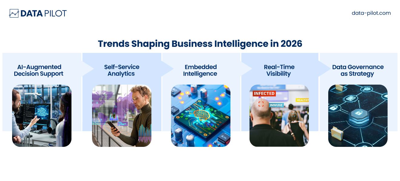
Choosing a tool isn’t just about today, it’s about where analytics is heading. So, be very careful when choosing one. Here are the forces shaping BI this year and what you should be looking at:
AI-Augmented Decision Support
Tools now suggest insights, detect anomalies, and forecast outcomes automatically. You don’t need to prompt it or manually go over the data. This should ideally be instant so you can focus on adjusting strategy where it matters.
Self-Service Analytics
Non-technical leaders can explore data without depending on analysts. Most teams are non-technical, such as marketing, design, sales, finance, etc. They shouldn’t have to hold one of your analysts hostage to be able to derive insights and understand them.
Embedded Intelligence
Analytics is becoming part of everyday workflows, so your team should be able to make decisions while they are in different systems. This ensures action follows decisions or action is taken based on data at the right time.
Real-Time Visibility
Organizations expect live operational insight, so you don’t see the numbers weekly or monthly. The numbers are available every few hours or even minutes so you can keep track of what’s happening and what you should do about it.
Data Governance as Strategy
Trustworthy data is becoming a competitive advantage. You need a system with guardrails and custom permissions for access to data sources. The best BI tools align with these trends while supporting your organization’s long-term growth.
How to Choose the Right BI Tool for Your Business
The list above may show you several options that seem to offer exciting features and all the perks mentioned. However, you need to focus on what suits your organization and your team best. Instead of chasing features, focus on fit.
Ask:
- What decisions are we trying to improve?
- Who will use the tool daily
- How complex is our data environment?
- Do we prioritize speed, governance, or exploration?
- Will this scale with our growth?
A pilot rollout often reveals whether a platform aligns with your workflows and leadership style. Start small. Buy a small subscription, add a few users, test, report, and scale.
Remember:
The goal isn’t prettier dashboards. It’s smarter decisions.
In the next section, I’ll lay out a proper framework to follow to select the tool that best fits your needs.
A Practical BI Tool Selection Framework for Business Leaders
Choosing a business intelligence platform shouldn’t feel like gambling on features or following market hype. The smartest leaders approach BI tool choice like a strategic investment, because that’s exactly what it is. Use this simple framework to guide your decision-making. Think of it as a structured way to connect business needs with the right technology.
Step 1: Define the Decisions You Want to Improve
Start with outcomes.
Ask yourself:
- Which decisions currently feel slow or unclear?
- Where do we rely too heavily on manual reporting?
- What visibility gaps are costing us time or revenue?
You’re buying better judgement at scale.
Write down 3–5 high-impact decision areas, such as:
- Revenue forecasting
- Operational efficiency
- Customer behavior tracking
- Resource allocation
These priorities should drive every evaluation that follows.
Step 2: Identify Your Primary Users
BI tools fail when they’re built for one audience but used by another. You need to understand how will be using the tool and how often.
Clarify:
- Will executives use dashboards daily?
- Do analysts need deep modelling capability?
- Will department heads explore data independently?
Match tool complexity to user comfort. A powerful platform that intimidates your team and isn’t easy-to-use becomes shelfware. The right system should feel empowering, not overwhelming and take little time to set up.
Step 3: Assess Your Data Environment
Understanding your data reality prevents integration headaches later.
Consider:
- Where does your data live today? (CRM, ERP, spreadsheets, cloud platforms)
- How clean and structured is it?
- Do you need real-time data or periodic updates?
Some tools thrive in complex ecosystems. Others excel in simpler setups. Your infrastructure should guide your shortlist.
Step 4: Evaluate Scalability and Governance Needs
Think beyond today. Consider where you will be one year from now, or five years from now.
Ask:
- Will this platform grow with our business?
- Can we maintain consistent definitions across teams?
- Do we require strict data security or compliance controls?
If leadership alignment and trust are critical, governance features matter as much as analytics power.
Step 5: Prioritize Decision Speed and Accessibility
The best BI platform reduces friction between question and answer.
Evaluate:
- How quickly can insights be generated?
- Can non-technical users explore data?
- Does the interface support fast executive review?
If insight takes too long, it loses strategic value.
Step 6: Run a Real-World Pilot
Before committing, simulate real business scenarios.
Test:
- A live dashboard executives would use
- A reporting workflow analysts handle today
- Cross-department collaboration
Watch how your team interacts with the tool. Adoption signals matter more than feature lists.
Step 7: Measure Long-Term Value
Price matters but value matters more.
Consider:
- Time saved in reporting
- Faster decision cycles
- Reduced operational blind spots
- Improved collaboration
A strong BI platform pays for itself through smarter execution. For example, a company spends $50,000 a year on a BI platform. Before using it, generating a monthly sales report takes a team of three analysts about 40 hours each month. After implementing the BI tool, dashboards automatically pull the data, and the report can be generated in just 4 hours, often without the involvement of analysts.
- Time saved: 36 hours per month × average analyst rate (say $40/hour) = $1,440 saved per month, $17,280 per year.
- Faster decisions: Management can spot trends and respond to market changes immediately, potentially increasing revenue and cutting losses.
- Better insights: Teams can run “what-if” scenarios or drill deeper into data without extra effort.
Even after accounting for the $50,000 platform cost, the company sees clear ROIfrom labor savings and from faster, smarter business decisions that could add far more value than the tool costs.
A Simple Leadership Checklist
Before making a final decision, follow this checklist:
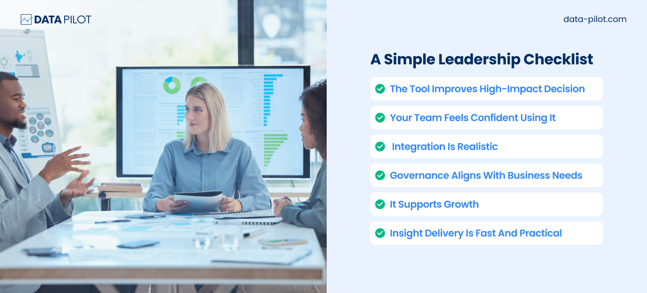
If you can confidently check these boxes, you’re choosing strategically. A BI platform should feel less like software procurement and more like building a decision engine for your organization. When chosen thoughtfully, it becomes a quiet competitive advantage that helps leaders act with clarity, speed, and confidence.
Final Thoughts
It’s now 2026, and business intelligence is highly necessary. Leaders who use data effectively respond faster and allocate resources better. They also easily spot opportunities that competitors miss. The right BI platform becomes part of your decision-making rhythm, which is why making informed choices is essential. Whether you need enterprise governance, rapid exploration, embedded analytics, or real-time visibility, there’s a tool designed for your priorities.
The real advantage comes when insights move from dashboards to action. Because data only matters when it drives better decisions.
Ready to turn your data into smarter decisions? Data Pilot helps teams design, implement, and scale BI solutions that get used. From setting up dashboards to creating automated insights, we make sure your BI investment delivers real value. Drop us a note at so*******@********ot.com to see how your data can start working harder for your business.